
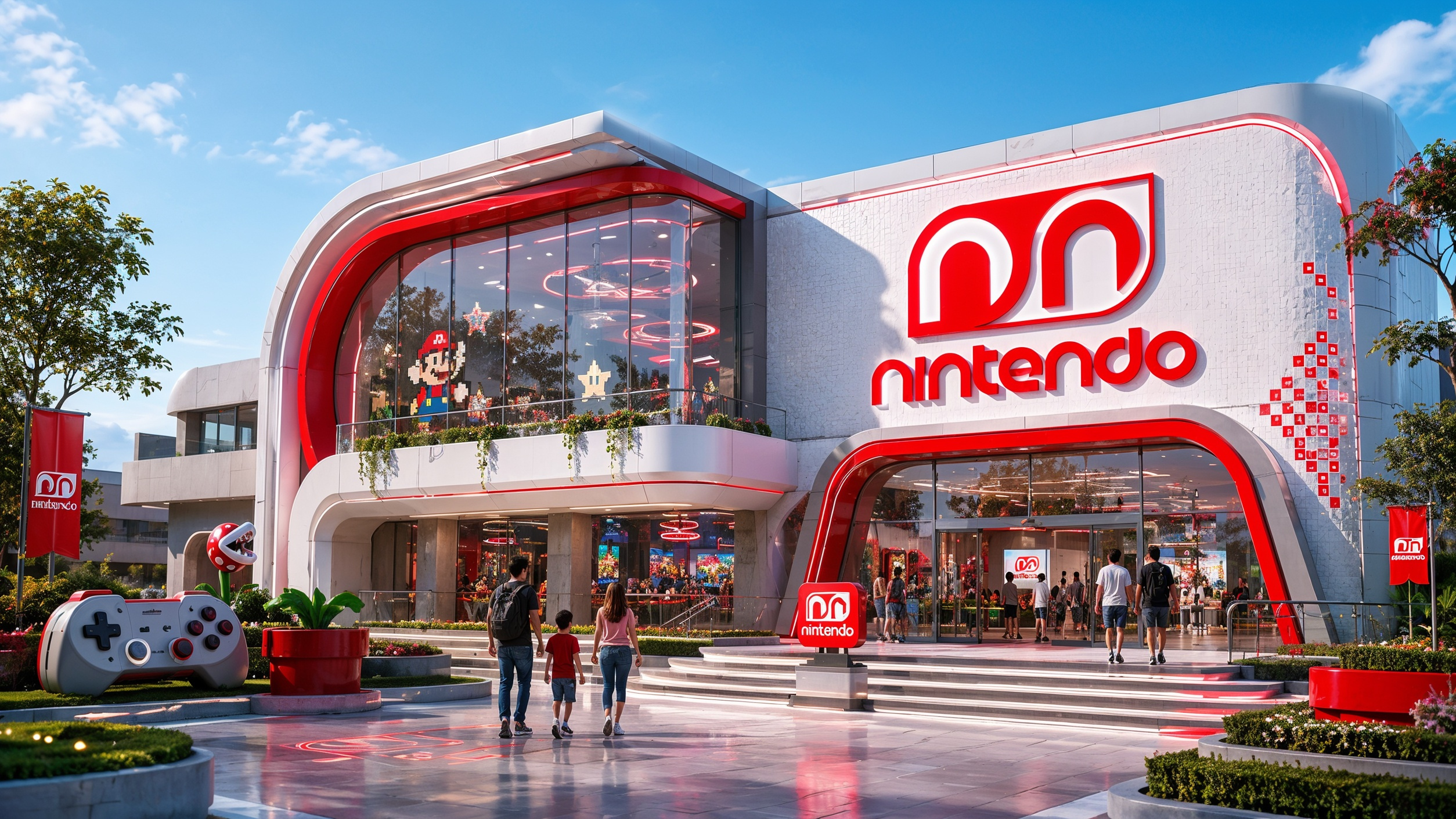
Two halves of one mark.
Nintendo was founded in 1889 by Fusajiro Yamauchi in Kyoto, where the company is still headquartered — which makes it the oldest video game company in the world, and the one that put both the handheld and motion control into the industry in the first place. Rebranding a company with that much history means the change has to be argued for, not just drawn.
The argument is yin and yang. Nintendo's games are built to be shared: you play them with someone else, and you come away having learned something about them and about yourself. So the mark is two halves of a single form, each one the negative of the other, neither complete on its own. The palette is Japan's flag and nothing else — red and white.
The system carries that idea outward. The stationery takes its silhouette from the Game Boy, and a pattern drawn from the company's own characters runs quietly through the letterhead, folder, envelope and disc — dozens of faces, none of them louder than the mark. On top of it sits the campaign: 'Life is all about…', which drops each character into a real photographic world rather than a game one, Pikachu on a rock face, Sonic in a library, Donkey Kong in a fight cage. It ran as indoor posters, press and magazine ads, and out of home.